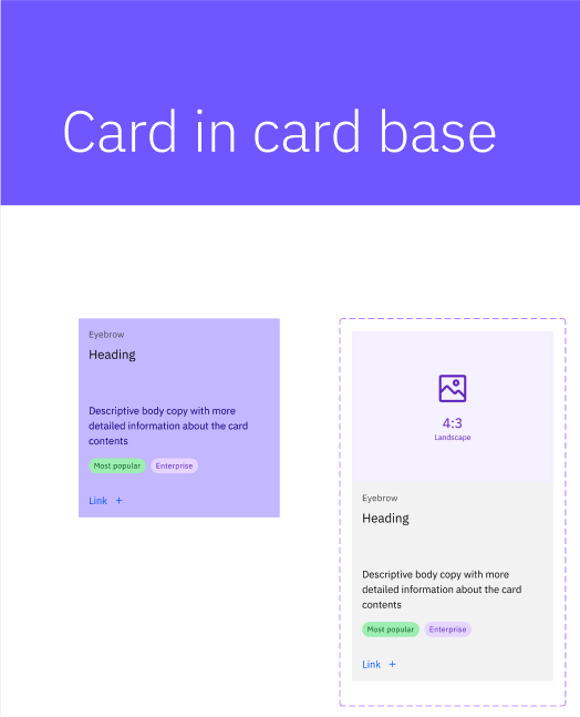
In transitioning from Sketch to Figma, IBM had a lot of work to make a complete library of components that were in Sketch. I contributed through the delicate work creating the components in Figma to be used in by 100s of designers where consistency and accuracy were very important.
"Card" Component

Card Static - Base Component
Challenge
Cards are a core component of the IBM Carbon Design system because they are used in nearly every context a designer will encounter. There needs to be a lot of flexibility to account for a wide range of content.
Approach
The first pass was creating static version base, followed by variants. This made sure the basic pipeline worked before adding more complexity.
Card Static - Variants
The second pass was accounting for different sized and typed content (including video), making sure the base component was contstructed robustly enough to accomodate these variables.
Card Dynamic - Base
Result
This ended up with 150 card variants that went live for IBM Designers across the globe. These included variants on content, colors, and breakpoints to account for different screen sizes.
Card Dynamic - Variants
Ideas for future improvements
Were I do revisit these cards, I would likely make better use of booleans to make the customization even easier for the users of these components.


